Portfolio Website > Anything Else to Sell Products In Your Sleep
Here are 5 stunning websites you can learn from

Photo by Ron Lach on Pexels
According to Pat Flynn, there are only two things on the Internet you can own: an email and a website.
You rent everything else, including social media.
For this reason, having your own site is important. You can build an email list, share your knowledge, and make money from your products. Preferably all three.
Here are five inspiring examples.
#1: Bruno Simon — bruno-simon.com
Bruno’s website is like nothing I’ve seen before.
When you visit his homepage, you’re greeted by this “START” button:

Screenshots from bruno-simon.com
And when you click it, you land on this:

You get to drive a jeep and check out his work!
If this wasn’t enough, you can smash into obstacles. The sound effects make it feel real.
Driving down the “desert” takes you to his socials.
Here, you can hover over them and press “enter”. (A link opens in a separate tab):
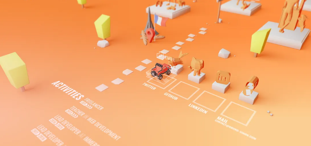
When you drive to the right, you end up in the projects section.
Here, Simon shows you what he’s been working on.
One thing I love is how the screen angle changes to capture his projects from high above:

When it comes to making a website like this, I wouldn’t know where to start. I suspect you don’t either.
Simon has your back.
When you drive for long enough, a chatbot appears in the bottom-right-hand corner. It asks if you’d like to create cool websites like this:

When you click “Yes, teach me!”, you’re taken to Simon’s online course page:
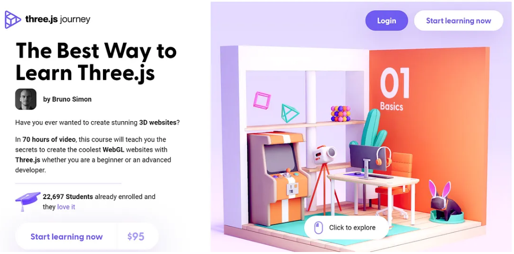
Screenshot from threejs-journey.com
Simon doesn’t need to do much persuading at this point. He’s already shown off his skills.
I have shiny object syndrome so I won’t be buying his course just yet (despite being exceptional value for money). It’s on my future projects list, though.
I won’t spoil anything else.
Check out his website for yourself!
#2: Robby Leonardi — rleonardi.com/interactive-resume/
Here’s another example of a fun website.
Visit the URL above, and you land on this. It has a Super Mario feel to it!

Screenshots from rleonardi.com/interactive-resume/
You can use the up and down keys on your keyboard to move, and there are different levels.
Level one tells you about Robby:

Run some more and you learn about his skills, as well as his love of the NBA.
Level two takes you underwater:

And on it goes.
You can’t tell from the screenshots but there are lots of great details.
For example, when the superhero is underwater, a little air bubble leaves his mouth every three seconds. (Yes, I counted.)
I won’t spoil the end of the game.
It’s safe to say Robby has nailed it.
#3: Kevin Parry — kevinparry.tv
Kevin is an animator.
He makes objects come alive.
Like many people, I’ve seen Kevin’s posts. One of his videos has 75 million views. He’s also appeared on Canada’s national news.
Then I stumbled on this:
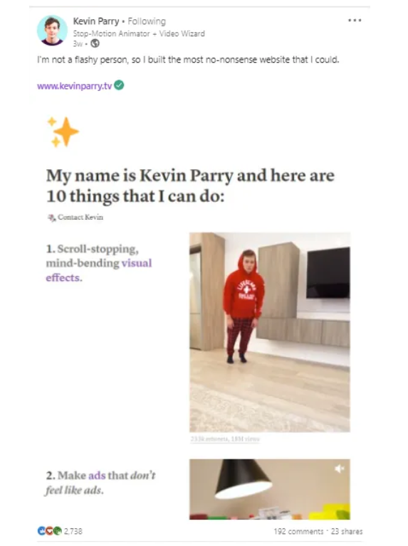
Screenshot from Kevin Parry’s LinkedIn
One of the first things you’ll notice is how simple his website is.
I didn’t realise straight away, but he’s made the whole thing on Notion:

Here’s a Notion guide for building a site in seconds.
Kevin lists clients he’s worked with and brand collaborations.
Right at the top is a link to contact him:

Screenshots from kevinparry.tv
This takes you to a separate page where you can drop him a message.
There are also links to his social media:

The intent of his site is clear. He wants people to work with him.
Sometimes, the best thing you can do is remove distractions.
Let your work speak for itself.
#4: Olga Pope — olgapope.com
Olga’s website is copywriting perfection.
And it looks beautiful.
And it’s full of personality.
Basically, it’s everything you could want from a portfolio website!

Screenshot from olgapope.com
I discovered Olga’s work when she commented on my articles. Some of her articles have gone viral. This one’s about how she quit her job and tripled her income in one year.
Let’s look at her site.
Straight away, you’ll see her personality shine through. It’s not just in the copy. Every detail has been thought of, including the navigation.
I particularly like her use of Aww.
This takes users to her client testimonials:

Screenshot from olgapope.com
Now let’s admire her writing.
The text below shows her talent. It also slips in some emojis which I’m a sucker for!

Screenshot from olgapope.com
There are so many details I can pick out.
To wrap things up, though, let me take you to the bottom. This is an area of a website many people neglect.
Not Olga.
I love the contrasting colours, the sassy headings, and the details she shares about her life:

Screenshot from olgapope.com
By sharing these details, it’s easier to connect with Olga on a deeper level. When I reached out to her, for example, I was able to reference the breaking-an-apple-in-half party trick.
(I thought she’d picked it up from Bob Mortimer. It turns out she hasn’t!)
One final thing.
When you click on “drop me a line”, it takes you to this:

Screenshot by the author
She makes it super easy to contact her.
You’re taken to your email and you don’t have to worry about the subject line! Olga takes care of this whilst letting her fun, bubbly personality shine through.
You must check out her website!
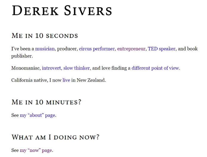
#5: Derek Sivers — sive.rs
Just like Kevin, Derek keeps things simple.
Let’s start with the URL. He’s taken simplicity to a whole new level.
Whereas most people would use dereksivers.com, Derek has picked his surname and stuck a dot in the middle — sive.rs.
The .rs is an extension, just like .com. (In case you wondered, .rs is the country code extension for Serbia.)
Derek owns dereksivers.com as well. When you search this in Google, it redirects you to sive.rs.
The site is pure HTML. He also uses Georgia Serif on all public-facing work, including his books.
Whenever I see this font, I think of Derek.
Screenshot from sive.rs
One of my favourite pages is his ”now” page.
He regularly updates it and lets readers know what he’s working on:

Screenshot from sive.rs
One final thing is Derek’s online store.
If you want to buy his books, visit this URL. (Anything You Want is one of the best books I’ve ever read.) You simply type in your details:
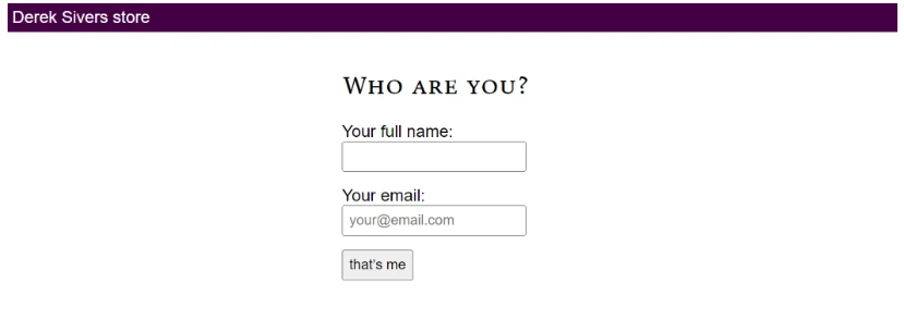
Screenshot taken from sivers.com/f
You’ll then be sent an email.
I don’t know how this works, but I admire Derek’s attention to detail. Asking users to jump to email means you don’t need to store login details:
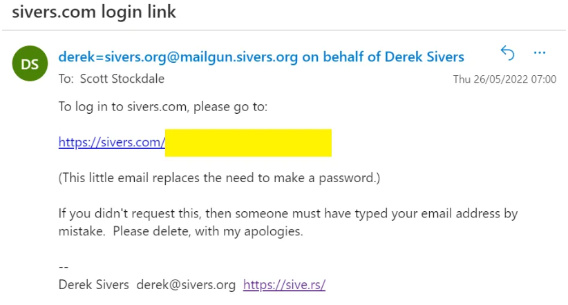
Screenshot by the author
You just click the email link and get taken to a page like this:

Screenshot from sivers.com/f
Derek’s pricing means once you’ve bought the digital versions of a book — priced at $11 — you pay just $4 for each paperback copy.
This $4 covers the printing costs.
For example, because I’ve already bought How to Live, I only pay $4 if I order a paperback. I paid $15 the first time around, and his system knows.
I would pay $15 for Hell Yeah or No because I haven’t bought this before:

Screenshot taken from sivers.com/f
Derek’s generosity is one of many reasons I admire him.
If you’re unfamiliar with his work, you’re in for a treat!
Takeaways
Simon, Robby, Kevin, Olga, and Derek have websites to die for.
They have their own style. They do their own thing. And they let their personalities shine.
Here are three key elements I see in them all:
Simplicity — You don’t need lots of bells. A beautiful design can do the heavy lifting.
Intentional — What is the purpose of your site? Simon, Bobby, Kevin, Olga, and Derek have clear calls to action.
Personality — Don’t be boring. Pay attention to the details and show who you are.
Bring these together, and you’re golden.
Happy creating!
Want to ditch the 9–5? Get my free 19-page guide: Everything I Did to Quit My 9–5 Job & Transition Into Profitable, Sustainable Solopreneuring :)